How to use colors in painting? Basic Color Theory for Artists

Colors surround us everywhere, filling the world with colors and emotions. They play a key role in our perception, influencing mood and conveying information. Color can change the feeling of space and shape, evoke associations and an emotional response. Understanding color theory and coloristics is necessary for every artist and designer in order to consciously use color in their work, select harmonious combinations and convey emotions and ideas.

What is color theory? Basics and usage examples

The theory of color is fundamental in art and design, helping artists create harmonious and expressive works. It encompasses knowledge about how colors interact with each other, how they are perceived by the viewer, and what emotions they evoke.


Color theory is applied in various fields, including painting, interior design, fashion, graphics, and advertising. In each of these areas, an understanding of color theory helps achieve specific goals. In painting, color theory is used to create harmonious compositions, express emotions, and convey moods. Interior designers use color theory to create cozy and aesthetically pleasing spaces. In the world of fashion, colors are chosen to highlight individuality and style, as well as to set trends. Graphic designers and marketers use the principles of color theory to create effective visual branding, ensure its correct perception by the target audience, and communicate the message.


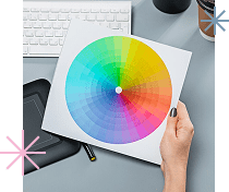
The color wheel, developed by Isaac Newton in 1666, is one of the key tools in color theory. Newton discovered that white light can be broken down into a spectrum of colors. He arranged them in a circle in a specific order. Newton’s circle allowed for the visualization of the relationships between colors and their interactions, which is especially useful when selecting color combinations for various projects.


Color harmony is achieved by using color combinations that are pleasing to the eye and create a balanced perception. This can include analogous colors, which are located next to each other on the color wheel, or complementary colors, which are opposite each other. Harmonious combinations create a sense of unity, while contrasting colors help highlight important elements and attract attention.


Did you know that our perception of colors can be “tricked”? There is a phenomenon known as the “Munch effect.” The artist Edvard Munch, famous for his paintings, including “The Scream,” used an interesting technique: he applied complementary colors to create a sense of vibration and movement in his works. These colors, when placed side by side, would seem to “tremble” before the viewer’s eyes, enhancing the emotional effect. This phenomenon is still used by artists and designers today to create visually dynamic and attention-grabbing compositions.


Contrast in color theory also plays an important role. It allows for the creation of emphasis and highlighting certain parts of the composition. Contrast can be achieved through:


  • differences in shades;
  • degrees of saturation;
  • brightness of colors.

For example, the use of dark blue and light blue creates depth and variety, while the combination of bright red and gray draws attention and accentuates key elements.


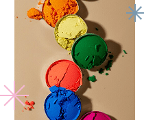
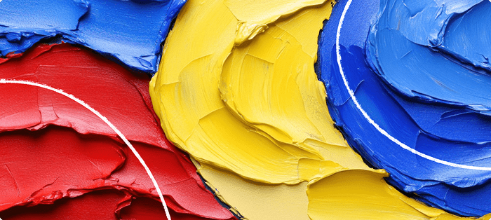
The primary colors in color theory – red, blue, and yellow – serve as the foundation. Secondary colors, such as orange, green, and purple, are created by mixing primary colors. Tertiary colors are formed by mixing a primary and a secondary color, which provides an even broader range of shades. Understanding these basic principles allows artists to create diverse and complex color palettes.


For many years, color theory has evolved thanks to the work of many scientists and artists. Johann Wolfgang von Goethe, in his book “Theory of Colors,” explored the psychological impact of colors and their perception by humans. His work greatly influenced the development of color theory and resonated with many artists, such as Wassily Kandinsky and Edvard Munch. In the 20th century, Josef Albers conducted extensive research on the interaction of colors and wrote a book. In “Interaction of Color,” he studied how colors influence each other when placed side by side. This research made a significant contribution to understanding color theory in art and design.


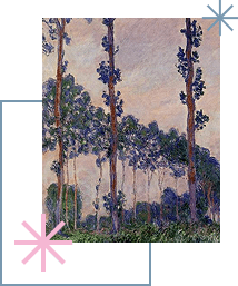
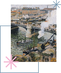
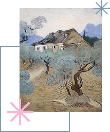
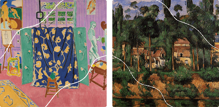
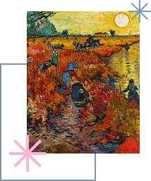
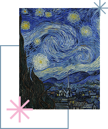
Examples of the use of color theory can be seen in the works of artists such as Vincent van Gogh, Henri Matisse, Paul Cézanne, and other renowned painters.


Van Gogh often used contrasting and complementary colors to create expressive works. His famous painting “Starry Night” utilizes the contrast between blue and yellow tones, creating a dynamic and emotional effect. His knowledge of color theory allowed him to convey deep emotions and enhance the visual impact of his paintings.


One of the leading representatives of Fauvism, Henri Matisse, used bright, saturated colors and contrasting combinations to express emotions and create dynamic compositions. His painting “The Dance” is an excellent example of the use of bright complementary colors, such as red and green, to create a powerful visual effect.


French Post-Impressionist Paul Cézanne experimented with color and form to convey depth and volume in his still lifes and landscapes. His painting “Mont Sainte-Victoire” demonstrates the use of color contrasts and shades to create a sense of perspective.


These artists showed how color theory can be used to create powerful, expressive, and memorable works that continue to inspire viewers and aspiring artists for centuries.

Color scheme and color palette: meaning and application

Color plays a key role in art and design, influencing our perception and emotions. Understanding terms such as color scheme and color palette helps artists and designers consciously use color to create harmonious and expressive works. Let’s explore what a color scheme and color palette are, as well as their differences and significance in artistic practice.

Color Scheme

A color scheme refers to the entire spectrum of colors that can be used in a work of art. The primary colors – red, yellow, and blue – serve as the foundation for creating all other colors. By mixing these primary colors, artists can obtain secondary and tertiary colors, which broaden the color scheme. For example, the secondary color orange is created by mixing primary red and primary yellow, while a warm orange can be obtained by adding more red to it.


A color scheme helps artists create a certain atmosphere and mood in their work. For instance, a warm scheme, which includes red, orange, and yellow, can evoke a sense of warmth and coziness, while cool colors like blue, green, and violet create a feeling of coolness and calmness.

Color Palette

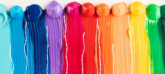
A color palette is a specific set of colors chosen by the artist to create a piece of art. Unlike the color scheme, which encompasses all possible colors, a palette is limited and selected based on the goals and objectives of the project. The artist deliberately uses a narrower or broader spectrum of shades.


A limited palette is suitable for creating a minimalist and cohesive image. For example, a monochromatic palette that includes various shades of one primary color.


In the history of art, many great artists have used limited palettes to create their masterpieces. Pablo Picasso, in his painting “Blue Period,” primarily used blue shades to convey melancholy and depth in his works. This approach allowed him to focus on the emotional content while using minimal colors for maximum impact.


A diverse palette is used to create more complex and rich compositions. It can include not only primary but also secondary and tertiary colors to create a rich variety of colors.


One vivid example of using such a palette can be seen in Georges Seurat’s painting “A Sunday Afternoon on the Island of La Grande Jatte.” The goal was to create a bright and dynamic image through a complex visual effect that draws attention and evokes an emotional response from the viewer. The diverse palette included red, blue, yellow, green, orange, and purple. Seurat used the technique of pointillism, applying small dots of pure colors to the canvas. These dots, blending in the viewer’s eye, created new shades and vibrant color effects. For instance, the transitions in shadows and light, created by layering dots of various colors, added depth and liveliness to the painting.

How to Choose a Color Palette for Yourself?

Choosing the right palette helps the artist achieve harmonious color combinations and desired visual effects. The approach to selection depends on many factors, such as the theme of the artwork, the desired mood, technical capabilities, and personal preferences.

To make the right choice, follow these tips:


  1. Before deciding on a palette, think about what you want to convey with your work. What theme or idea underlies your piece? What mood do you want to create?
  2. Study color theory. Using the color wheel will help you find harmonious color combinations.
  3. Start with a limited palette. This will help you better understand how colors interact with each other and how different shades and tones can be created.
  4. Don’t be afraid to try new color combinations and experiment with palettes. Seek inspiration from nature, art, and the world around you. Try creating a palette based on your favorite landscape or artwork.

Create several test palettes and try them out on small sketches or in digital format to see how they work in action.


  1. Consider lighting. It can significantly affect the perception of colors. When choosing a palette, think about the lighting conditions under which your work will be viewed. For example, daylight and artificial lighting can display the same colors differently.
  2. Most importantly, trust your inner instinct and intuition. Choose colors that you like and that evoke positive emotions. Art is personal expression, and your palette should reflect your feelings and vision.

Choosing a palette is a creative process that takes time and experience. Understanding the basics of color theory and experimenting with different colors will help you find your unique style.


In summary, a color scheme encompasses all possible colors that can be used in art, while a color palette is a specific selection of colors for a particular piece. The scheme is the overall spectrum, whereas the palette is a limited set of colors specifically chosen to achieve certain aesthetic goals.


Understanding the differences between a color scheme and a palette, as well as the ability to select the right colors for your work, are important skills for every artist and designer. This knowledge helps create harmonious, expressive, and memorable artworks that capture attention and evoke an emotional response from viewers.

Color scheme and its types

A color scheme is a method of selecting and combining colors to create harmonious and expressive artworks. Using the color wheel, various schemes can be chosen, each helping to achieve specific visual effects and moods. Understanding these schemes and applying them in art allows for the creation of works that look harmonious and appealing.

Analogous Color Scheme

According to the analogous color scheme, colors that are next to each other on the color wheel are used. These colors create smooth transitions and harmonious combinations, making them ideal for creating calm and cozy works.


Claude Monet, the famous impressionist, often used analogous schemes in his paintings. In his work “Water Lilies,” one can notice how he applies combinations of green, blue, and cyan to create a peaceful and tranquil mood. Such schemes are often used to convey a sense of natural harmony and calm. Ivan Shishkin and Konstantin Savitsky also used analogous schemes in their landscapes to create a feeling of unity and wholeness with nature. Their paintings often contain calm, similar shades of green and brown.


Analogous schemes are especially effective in depicting nature, where colors often blend seamlessly, as seen in forests or bodies of water.

Complementary Color Scheme

The complementary color scheme involves using colors located opposite each other on the color wheel. This creates a bright and dramatic contrast, drawing attention to the main elements of the painting.


Thomas Gainsborough, the English portraitist, used complementary colors in his painting “The Blue Boy.” Here, the boy’s blue suit contrasts with the dull orange background, making his figure stand out brightly.


Complementary schemes are used to create visual focus and dynamism in a painting, but it’s important to avoid oversaturating contrasting colors to prevent conflict between elements.

Tertiary Color Scheme

The tertiary color scheme includes three colors that are evenly spaced on the color wheel. This scheme helps create a balance between harmony and contrast.


In Henri Rousseau’s painting “The Dream,” a tertiary scheme is used where green dominates, cool blue complements it, and warm orange highlights key elements. This helps create visual interest and structure.


Tertiary schemes allow for the creation of complex and dynamic compositions while maintaining harmony and balance.


To create harmonious color combinations, specialized tools like Adobe Color, Coolors, and Paletton can be used.


  1. Adobe Color allows you to create and save color palettes using various color schemes. You can choose primary colors, create palettes based on images, or customize color harmonies. Pros: intuitive interface and integration with other Adobe products.
  2. Coolors generates color palettes automatically based on user preferences and allows easy color adjustment and rearrangement. You can save palettes and export them in various formats. Features: convenient and easy-to-use interface, ideal for quick palette creation and editing.
  3. Paletton provides the ability to create color schemes using various methods, including analogous, complementary, and triadic schemes. Users can customize colors and view them in different applications. Advantages: detailed settings and visualization of schemes in various combinations.

However, if you strive for a professional level in drawing, it’s important to learn how to select color palettes independently.


Color schemes are a powerful tool in the arsenal of artists and designers, helping to create works with different emotional effects. Understanding different types of color schemes and how to apply them allows better control over the visual perception of the work by viewers.

The meaning of Itten's color circle for painting

The color wheel is a crucial tool in color theory, helping artists and designers understand how colors interact with each other. It is a visual representation of the color spectrum, arranged in a circular format. Throughout history, there have been several versions of the color wheel: Newton’s, Ostwald’s, and Itten’s. Let’s take a closer look at them.  

From Newton to Ostwald – The Evolution of the Color Wheel

The first attempts to systematize colors began with Isaac Newton at the end of the 17th century. In 1666, he conducted his famous experiment with a prism, which allowed him to break white light into a spectrum of colors. The result of his work was a color wheel that reflected the natural arrangement of colors in the spectrum. The colors in this wheel include red, orange, yellow, green, blue, indigo, and violet. This wheel became the foundation for further research and the development of more complex models.   In the early 20th century, Wilhelm Ostwald developed his own version of the color wheel. Unlike Newton’s wheel, which was based on the pure spectrum, Ostwald’s wheel included more complex concepts such as saturation and brightness. He divided the colors into three categories: primary, secondary, and tertiary, and introduced the concepts of shades and tones. Ostwald’s wheel was important for understanding not only the relationships between colors but also their qualities.

Features of Johannes Itten’s Color Wheel

The most well-known and influential in the field of art is the color wheel developed by Johannes Itten, a German artist and educator, who created it in the early 20th century. Itten’s color wheel represents an improved and more complex model based on the ideas of previous scholars, but supplemented with new concepts.   Itten identifies three colors that form the basis for creating all other colors. These are red, yellow, and blue. They cannot be produced by mixing other colors and serve as the starting point for creating color palettes. He also defined secondary colors, which are obtained by mixing two primary colors. In Itten’s wheel, the secondary colors include orange, green, and violet. The tertiary colors included yellow-green, orange-yellow, and red-violet.   Itten’s color wheel introduces two key concepts that help create expressive and harmonious compositions:
  1. Complementary colors.
  2. These colors are located opposite each other on the wheel and create a bright contrast. For example, red and green, blue and orange, yellow and violet. Complementary combinations give paintings dynamism and draw attention to the main elements.
  3. Analogous colors.
  4. These colors are next to each other on the wheel and create smooth, harmonious transitions. For example, orange, yellow, and yellow-green. Analogous combinations help create a calm and balanced mood.
Itten’s color wheel also demonstrates color gradations, showing shades of a single color from light to dark. This helps to understand how colors change depending on their saturation and brightness, and how to create smooth transitions between them.   Many famous artists turned to Itten’s color wheel in their work. For example, Pablo Picasso often used complementary colors, such as blue and orange, to create bright contrasts and add dynamism to his compositions. In the painting “The Guitarist,” Picasso used these colors to draw attention to the central figure and create visual tension.   Another example is Henri Matisse, who used analogous color combinations to create harmony and balance in his works. In the painting “The Dance,” Matisse applied analogous shades of red, orange, and yellow to convey energy and movement, while creating a harmonious and balanced image.   Itten’s color wheel has become the foundation for many educational materials on art and design due to its versatility and practicality. It helps not only in the creation of artistic works but also in the development of designs for various fields such as fashion, graphics, and interior design.   Itten’s color wheel is a conceptual model that simplifies the understanding of complex color interactions. Its use allows artists and designers to effectively manage color in their projects. Understanding the color wheel in color theory and its basic concepts will help you better utilize color schemes and create works that attract attention and convey the desired mood.

Color Combinations: Three Basic Types of Color Combinations

Artists skillfully use various color combinations to convey their ideas and influence the viewer. Complementary, monochromatic, and analogous combinations play a key role in creating harmony, contrast, and eliciting emotional responses. Let’s break down each type of color combination separately.

Complementary Combinations

Complementary combinations are contrasting pairs of colors located opposite each other on the color wheel. Such combinations are typically bold and attention-grabbing. They enhance each other, making the image more lively and dynamic, while the visual tension ensures memorability. Contrasting combinations also help to highlight key details of the composition. Opposite colors are used together when the goal is to evoke strong emotional reactions from viewers.


In Vincent van Gogh’s works, complementary combinations are often seen. In his painting “Sunflowers,” the bright yellow flowers stand out against the blue sky, creating a striking contrast.

Monochromatic Combinations

Monochromatic combinations involve the use of different shades of a single color. Such palettes create a harmonious and calming effect, allowing the focus to shift to textures and shapes rather than colors. Monochromatic combinations convey a sense of unity and peace. The absence of color contrast emphasizes the forms and details of the image. Using different shades of one color helps to convey subtle changes in light and shadow.


For example, the artist James Whistler demonstrates monochromatic combinations in his paintings. In “Arrangement in Grey and Black: Portrait of the Artist’s Mother,” various shades of grey are used, creating an elegant and restrained image.

Analogous Combinations

Analogous combinations are groups of colors located next to each other on the color wheel. These combinations create a natural effect often seen in nature. Analogous colors are perceived by the eye as harmonious and balanced. They are excellent for creating smooth transitions between colors, which is useful when using gradient techniques. Additionally, analogous colors can convey different emotions depending on the chosen palette. Warm tones create coziness and energy, while cool tones bring calmness and freshness.


In the paintings of Gustav Klimt, analogous combinations are used to create rich and vibrant compositions. In his “Portrait of Adele Bloch-Bauer I,” golden and orange tones convey a sense of luxury and warmth.


Color combinations are a powerful tool in the hands of an artist. Complementary, monochromatic, and analogous combinations offer a wide range of possibilities for expressing ideas and emotions through color. Depending on the goals and mood of the artwork, the artist can choose the appropriate combination to achieve the desired effect.

Dry or wet: technologies for creating color solutions in painting

Color is one of the most important elements of art, capable of conveying mood, depth, and emotions in a work. Various color mixing techniques allow artists to achieve unique and expressive effects. Two main color mixing techniques are used to create interesting color solutions: wet and dry. A professional artist should master each of these techniques thoroughly.

Wet Color Mixing Technique

The wet color mixing technique involves using wet materials and tools, such as brushes and paints. This method allows the artist to create smooth transitions and realistic shades. For this, multiple colors are applied to the palette or directly onto the canvas, which are then mixed with a brush or other tool using soft, sweeping motions.
Features of the wet technique:


  • Smooth transitions: colors blend easily, creating gradients and delicate transitions;
  • Harmonious shades: the ability to achieve new shades and nuances;
  • Realism: the technique is ideal for creating lifelike images.

Imagine an artist painting a sunset. They apply bright orange and warm red colors to the canvas, then use soft brushstrokes to blend them, creating a smooth transition from one shade to another, conveying the fading warmth and light of the setting sun.

Dry Color Mixing Technique

The dry technique uses dry materials, such as pastels, chalks, or colored pencils. The artist layers different colors on paper and then blends them using fingers, a paper towel, or a special blending tool to achieve the desired effect.
Features of the dry technique:


  • Textural effects: creating interesting textures through dry blending;
  • Detail control: the ability to apply colors more precisely and create fine details;
  • Depth: layers of color allow for achieving depth and richness.

An artist paints a winter landscape using pastels. They apply blue and violet shades for the sky and then blend them to create the effect of frosty air and the soft, muted light of a winter day.

There are also other color mixing techniques:


  1. Glazing. This technique involves applying a transparent layer of another color over a dried layer of paint. It creates deep and rich hues as the lower layers show through the upper ones. Glazing is often used in oil painting.
  2. Airbrushing. This technique uses an airbrush to spray a fine layer of paint onto a surface. It allows for smooth gradients and subtle details.
  3. Imprimatura. This technique involves applying a thin layer of paint in one color to a primed canvas, creating a base tone for the entire painting. It helps the artist determine the overall color scheme and set the palette.
  4. Palette knife mixing. This technique involves mixing paints directly on the canvas using a palette knife (a special painting tool). This method creates textured and dynamic effects.

Each of these techniques has unique characteristics and can be used to achieve various artistic effects. By experimenting with different techniques, an artist can find their unique style and ways of self-expression through color.

Temperature parameters: warm and cool colors

The division of colors into warm and cool is purely subjective (in physics, it’s the opposite). Since childhood, we know that we can get burned by orange-yellow fire, while blue seas or violet storm clouds bring water and coolness. Therefore, when we look at these colors, associations with personal experiences unconsciously arise. The colors of real objects and phenomena shape our perception of them as warm or cool.


Why is it important for an artist to know about color temperature? Warm and cool colors play a significant role in artistic creation. They have different emotional and visual characteristics. If an artist uses them correctly, they can create the effects and moods they need in viewers.

Both warm and cool colors have a dual nature.

Warm reds, oranges, yellows, and their shades are associated with warmth, energy, passion, vitality, and at the same time – with danger and fury. Warm colors can evoke a sense of comfort, joy, and activity, drawing attention and creating visual dynamism, but they can also warn of danger.


There is a theory that red stimulates and excites the nervous system more than any other color. This reaction to red is due to the development of trichromatic vision in human ancestors and higher primates. It was easier to search for ripe fruits among the foliage.


In works of art, warm colors are often used for highlights and creating a sense of liveliness. For example, in Van Gogh’s painting “Wheat Field with Cypresses,” bright orange and yellow shades give the canvas a feeling of warmth and cheerfulness.


Cool colors include blue, green, violet, and their shades. These colors evoke associations with coolness, calmness, tranquility, and harmony. Although they can soothe and refresh, they also have a gloomy character and are sometimes associated with sadness and death. Cool colors are often used to convey a sense of calm and serenity or sadness. For example, in Monet’s works, such as “Water Lilies,” cool shades of blue and green create an atmosphere of silence and tranquility.


Sometimes cool shades can be perceived as warm, and warm ones as cool, especially with colors like lime green or lemon yellow, for instance. An artist can also intentionally create an effect where a warm color looks cool and a cool color looks warm just by placing them next to each other. It is useful to use the color wheel for this. Colors closer to red are considered warmer, while those closer to blue are cooler. Any color can change its perception depending on its undertone, except for orange, which always remains in the warm color category.


Understanding the interaction between warm and cool colors opens up opportunities for artists to create expressive and balanced compositions. Cool and warm colors placed next to each other enhance each other’s properties. In warm light, a cool shadow will fall from an object and vice versa. The contrast between these color groups can influence the impression and create visual interest.


Impressionists excelled in this. Artists managed the viewer’s mood by using colors of the right temperature. They achieved liveliness and naturalness in their works. In Picasso’s works, such as “Guernica,” the contrast of warm and cool shades is used to convey complex emotions without words. However, his work will leave no one indifferent.


Warm and cool colors are powerful tools in an artist’s arsenal. Their use allows not only to convey certain moods and ideas but also to evoke an emotional response from viewers. Mastering the features and possibilities of each color group helps artists create impressive and harmonious works of art.

Psychology of color: using color in paintings to create mood

Color can have a profound emotional impact on the viewer, which is a scientifically established fact. Research in the psychology of color shows that each color carries specific associations and can evoke certain feelings. These findings are supported by numerous studies, including the work of scientists such as Max Lüscher, who developed tests based on color perception, and John Lenne, who studied how color affects emotional states. Artists, recognizing this connection, consciously use colors to express their ideas and moods, thereby creating a strong emotional impact on the viewer.   Let’s examine in more detail how different colors can influence mood and emotions, and how artists have applied these principles to create expressive and profound works of art. For this, we will use the primary and secondary colors of the Itten color wheel.

Red (Primary)

Red color symbolizes energy, passion, and strength. It can provoke excitement, a sense of urgency, or even aggression. Its brightness attracts attention and creates a sense of dynamism. Examples:
  1. “The Arnolfini Portrait” – Jan van Eyck. In this painting, the red color of the Madonna’s clothing symbolizes her spiritual strength and importance. The bright red cloak creates a sense of solemnity and elevation, emphasizing the significance of the maternal figure against the intricately detailed interior.
  2. “Red Vineyard in Arles” – Vincent van Gogh. In this work, the red vineyards literally blaze with life energy. The vibrant red shades create a sense of the hot southern sun and hard work, conveying the emotional intensity and the artist’s passion for the nature surrounding him.
  3. “The Red Studio” – Henri Matisse. Matisse’s painting, saturated with red, creates a feeling of warmth and creative chaos. This red background highlights the objects and paintings in the studio, evoking a sense of energy and creative uplift, conveying the artist’s inner world full of passion and inspiration.

Blue (Primary)

Blue color is associated with calm, serenity, and reliability. It promotes relaxation and tranquility, creating an atmosphere of depth and peace. Examples:
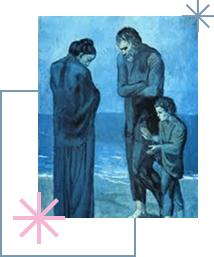
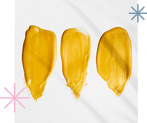
  1. “The Blue Period” – Pablo Picasso. In the series of paintings created by Picasso from 1901 to 1904, cold blue tones predominate. This period of the artist’s work is known as the “Blue Period.” The paintings from this time are imbued with melancholic emotions, depicting the poor, prostitutes, the blind, and the drunk. Reflecting human suffering in blue tones, Picasso deepened the emotional perception of his works, creating an atmosphere of sadness and despair while evoking sympathy and understanding.
  2. “Girl with a Pearl Earring” – Johannes Vermeer. In this masterpiece, Vermeer uses blue color on the girl’s headpiece, creating an impression of calm and serenity. The blue shade contrasts with the warm tones of her skin and clothing, highlighting the innocence and purity of her image. The painting evokes a sense of peace and contemplation, adding depth and nobility to the overall composition.
  3. “Starry Night” – Vincent van Gogh. In this famous painting by Van Gogh, blue color dominates, creating a night sky full of movement and energy. The blue tone not only conveys the calm and serenity of the night but also evokes a sense of admiration for the grandeur of nature. The painting conveys both tranquility and dynamism, creating a feeling of infinity and deep contemplation in the viewer.

Yellow (Primary)

Yellow color evokes associations with joy, warmth, and optimism. It has the ability to create a sense of energy, happiness, and vitality. Examples:
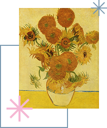
  1. “Sunflowers” – Vincent van Gogh. Van Gogh used yellow to bring a vibrant, life-affirming atmosphere. Yellow in “Sunflowers” symbolizes warmth and joy, creating a feeling of energy and optimism in the viewer. The painting literally radiates light and vitality, eliciting smiles and positive emotions.
  2. “The Kiss” – Gustav Klimt. In this work, Klimt uses yellow as a central color, enveloping the lovers in a golden glow. This warm hue symbolizes happiness and bliss, conveying a sense of love and tranquility to the viewer. The yellow background of the painting creates a feeling of sanctity and eternal joy.
  3. “The Young Reader” – Jean-Honoré Fragonard. In Fragonard’s painting, yellow tones highlight youth and serenity. The yellow color in the young woman’s clothing and the interior evokes a sense of lightness and joy, creating an atmosphere of warmth and innocence. This color palette conveys a feeling of happiness and tranquility to the viewer.

Orange (Secondary)

Orange combines the energy of red and the joy of yellow. It evokes feelings of enthusiasm, creativity, and fun. Examples:
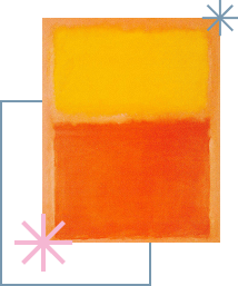
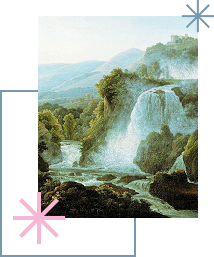
  1. “Orange, Red, Yellow” – Mark Rothko. In this abstract painting, Rothko uses orange to create a strong emotional impact. The combination of orange with red and yellow creates a sense of warmth and intensity. The painting evokes a feeling of energy and joy, inviting the viewer to immerse themselves in a world of emotions and sensations.
  2. “To the Storm” – Marek Langowski. In this work, Langowski uses orange to convey the drama and tension preceding a storm. Orange tones in the sky and water create a sense of anxiety and anticipation, enhancing the emotional perception of the painting and conveying a feeling of unease and joyful anticipation of the coming storm.

Green (Secondary)

Green is associated with nature, calm, and harmony. It promotes a feeling of freshness and relaxation. Examples:
  1. “The Arnolfini Portrait” – Jan van Eyck. In this masterpiece, Jan van Eyck uses green in decorations and clothing to convey a sense of well-being and stability. Green tones create an atmosphere of calm and comfort, emphasizing the harmony and understanding between the spouses.
  2. “Waterfall in Tivoli” – F.M. Matveev. Matveev’s painting is filled with various shades of green, conveying the freshness and tranquility of nature. The green trees and grass around the waterfall create a sense of peace and harmony, evoking a feeling of calm and unity with nature.
  3. “The Spring” – Alexander Repin. In Repin’s work, green tones dominate, creating an atmosphere of naturalness and relaxation. The spring, surrounded by greenery, symbolizes vitality and renewal, evoking a feeling of freshness and harmony in the viewer.

Purple (Secondary)

Purple symbolizes mysticism, luxury, and spirituality. It can evoke feelings of introspection and inspiration. Examples:
  1. “Three Trees in Overcast Weather” – Claude Monet. In this painting, Monet uses purple tones to convey an atmosphere of mystery and mysticism. The purple color creates a sense of depth and introspection, highlighting the intricate and enigmatic nature of the landscape.
  2. “Boulevard de Clichy, Rain Effect” – Camille Pissarro. The artist uses purple color to enhance the sense of luxury and spirituality in the scene. Combined with the rain and the bridge, the purple tones create an inspiring and slightly melancholic atmosphere, emphasizing the elegance and refinement of the urban landscape.
  3. “White House Among Olive Trees” – Vincent van Gogh. The artist uses purple tones to convey a sense of spirituality and introspection. The purple color in the painting emphasizes the mystery and luxury of the surrounding nature, evoking a feeling of tranquility and inspiration in the viewer.
Understanding color psychology is an important tool for artists, allowing them to effectively use colors to convey moods and emotions. Combining different colors and their shades opens a wide range of possibilities for creating expressive and impressive works of art. Color theory, based on an understanding of the color wheel, plays a key role in the education of artists. Color theory for artists involves studying color schemes and the emotional impact of colors, which allows for the creation of harmonious and expressive works. Using warm and cool colors helps convey different moods: warm colors, such as red and orange, evoke a sense of energy, while cool colors, such as blue and green, are associated with tranquility. Techniques of color mixing enrich textures and effects in paintings. Great artists like Picasso and Van Gogh demonstrate how well-chosen color schemes enhance emotional impact. Mastering the basics of color theory enables artists to create works that touch the soul and delight the viewer.

Question and answer

Color theory is a field in science and art that studies how colors interact with each other and how they are perceived by humans. The main elements of color theory include the color wheel, color schemes, and contrast. The color wheel is a diagram representing colors in a circular form. The color wheel helps visualize the relationships between colors. A color scheme is a combination of colors that is pleasing to the eye and creates a sense of balance and unity. There are several types of schemes. An analogous scheme uses colors that are next to each other on the color wheel. A complementary scheme uses colors that are opposite each other on the color wheel. A triadic scheme uses three colors that are evenly spaced from each other on the color wheel. A tetradic scheme uses four colors that essentially form two complementary color pairs. Contrast is the difference between colors that makes them more noticeable and expressive. There are several types of contrast: the difference between light and dark shades of the same color, the difference between pure and muted colors, the difference between warm and cool colors, and the use of complementary or opposite colors to create a striking visual effect. Understanding these basic elements of color theory allows for the creation of more harmonious, expressive, and visually appealing works of art. For example, an artist using an analogous scheme can fill a painting with soothing motifs, while complementary colors can create a vibrant and dynamic piece.
In traditional color theory, the primary colors are considered to be red, blue, and yellow. These colors are known as primary because they cannot be created by mixing other colors. They serve as the starting point for creating all other colors.   However, with the development of digital technologies, primary colors have changed. In color theory, especially concerning printing and digital media, other primary colors are used depending on the chosen color model. There are additive and subtractive color models.   The additive model (RGB) is used, for example, in computer screens and televisions. The primary colors in this model are red, green, and blue (Red, Green, Blue – RGB). These colors mix by adding light, allowing the creation of all other colors.
  • red: a primary color that, when mixed with green, produces yellow, and with blue, produces magenta;
  • green: a primary color that, when mixed with red, produces yellow, and with blue, produces cyan;
  • blue: a primary color that, when mixed with green, produces cyan, and with red, produces magenta.
The subtractive model (CMYK) is used in printing and is based on mixing inks. The primary colors in this model are cyan, magenta, and yellow (Cyan, Magenta, Yellow – CMY), with black (Key/Black – K) added to create depth and contrast.
  • cyan: a primary color that, when mixed with magenta, produces blue, and with yellow, produces green;
  • magenta: a primary color that, when mixed with cyan, produces blue, and with yellow, produces red;
  • yellow: a primary color that, when mixed with cyan, produces green, and with magenta, produces red.
In painting and traditional color theory, the primary colors remain red, blue, and yellow, while in digital media and printing, other models with different primary colors (RGB and CMYK) are used.
An artist must have a deep understanding of color theory to create expressive and harmonious works. There are several key aspects that they need to know. Firstly, the color wheel: the artist must understand how colors are arranged on the wheel and how they interact with each other. This includes knowledge of primary, secondary, and tertiary colors, as well as their relationships. The color wheel is the foundation of color theory. Secondly, color schemes – the use of color combinations that are visually pleasing and create balance: analogous, complementary, and triadic. The artist should be able to create color combinations for their works. Thirdly, understanding contrast for greater expressiveness, and the different types of contrast: in hue, saturation, and temperature. Additionally, the artist should understand how color temperature affects the perception of a painting. For example, red, orange, and yellow create a sense of warmth, energy, and attract attention, while blue, green, and purple create a sense of calm, coolness, and distance. Moreover, it is important for the artist to know the psychological properties of each color and how to use them to convey the mood and idea of the painting. However, knowing color theory alone is not enough. The artist must experiment with colors, create sketches and studies to better understand how different color combinations work in practice. Understanding and applying color theory makes the artist’s work more professional and helps convey the concept and emotional message to the viewer.

One of the earliest color theorists was Isaac Newton. In 1666, he conducted an experiment that changed the understanding of color and light. Newton passed a beam of white light through a prism and discovered that white light splits into a spectrum of colors: red, orange, yellow, green, blue, indigo, and violet. He concluded that light consists of many colors and arranged them in a circle, creating the first color wheel. This wheel allowed for the visualization of color relationships and became the foundation for further research in color theory.

Johann Wolfgang von Goethe, the famous German writer and scientist, also made significant contributions to color theory. In 1810, he published the work “Theory of Colors,” in which he proposed his interpretation of color perception. Goethe focused on the psychological aspects of color and its effects on people. Unlike Newton, who considered the physical properties of light, Goethe studied how colors are perceived by the eye and mind. He developed a color wheel that emphasized the emotional impact of colors, dividing them into warm and cool categories.

Johannes Itten (1888-1967) was a Swiss artist, educator, and color theorist whose work significantly influenced the development of color theory and art education. He was one of the teachers at the renowned Bauhaus School and developed unique approaches to studying color. Itten created numerous exercises and methods for teaching students how to work with color. He used practical sessions where students experimented with colors, creating color compositions and studying their interactions. This approach to teaching had a significant impact on pedagogical methods in art.

Johannes Itten made important contributions to color theory by offering a systematic approach to studying and using colors. His work and teaching methods have helped many artists and designers better understand color and its possibilities, as well as create more expressive and harmonious works. Itten’s contributions remain relevant today, continuing to influence contemporary art and design.

Albert Munsell, an American artist and educator, developed his color classification system in the early 20th century. He created a three-dimensional color space system that included three color characteristics: hue, saturation, and brightness. Munsell developed a color atlas that allowed for the precise determination and classification of colors based on these three characteristics. His system is still used in various fields, such as design, art, and science, for accurate color identification and reproduction.

The three colors – red, blue, and yellow – are called primary colors because they cannot be created by mixing other colors. These three colors serve as the starting point for creating all other colors and shades. By mixing primary colors, secondary colors are obtained. These are orange, green, and purple. Tertiary colors result from mixing a primary color with a secondary color: red-orange, yellow-orange, yellow-green, blue-green, blue-purple, and red-purple. Understanding these combinations helps artists and designers create rich and diverse palettes for their work.
The main rule of color theory is the rule of harmony and contrast. When working with color, it’s important to achieve a harmonious combination and use contrast to create balanced and expressive visual effects. Harmonious color schemes create a sense of unity and tranquility. For example, analogous colors placed next to each other on the color wheel or triadic colors equally spaced on the color wheel help create a balanced composition. Harmony is achieved by combining colors that work well together. Contrast is a principle used to highlight and draw the viewer’s attention to details in the artwork. Differences between colors help make elements more noticeable and expressive. For instance, using complementary colors that are opposite each other on the color wheel, or contrast in saturation, helps emphasize key details and create vibrant, expressive combinations and dynamic effects. Applying the basic rule of color theory allows an artist to create visually appealing and balanced paintings.
A pure color is a color that does not contain any impurities from other colors. It is bright, saturated, and maximally intense. Pure colors can be either primary or any other color in the spectrum, as long as they are not diluted or mixed with other colors. Primary pure colors:
  • pure red: an intense, bright red color without impurities, for example, the color of a poppy flower;
  • pure blue: a deep, saturated blue color, for example, the color of lapis lazuli;
  • pure yellow: a bright, saturated yellow color, for example, the color of sunflower petals.
Secondary pure colors:
  • pure orange: a mix of pure red and pure yellow, for example, the color of an orange.
  • pure green: a mix of pure blue and pure yellow, for example, the color of fresh grass.
  • pure purple: a mix of pure blue and pure red, for example, the color of a violet.
Tertiary pure colors:
  • pure red-orange: a mix of pure red and pure orange, for example, the color of coral;
  • pure yellow-green: a mix of pure yellow and pure green, for example, the color of lime;
  • pure blue-green: a mix of pure blue and pure green, for example, the color of turquoise.
Why are pure colors important in painting? They are easily noticeable and can be used to create accents in a composition. For example, a bright red element on a neutral background immediately draws attention. Pure colors, especially complementary ones, create strong visual contrast, making the composition more dynamic and expressive. Pure colors are also associated with certain emotions and moods. For example, a saturated yellow can evoke a feeling of joy and energy, while pure blue can convey a sense of total calmness and reliability. For instance, Van Gogh often used pure colors in his paintings to convey intense emotions and create vivid images. Thus, pure colors play a significant role in art, helping to create bright, expressive, and emotionally charged works.

In traditional painting, the primary colors are red, blue, and yellow. These colors are known as primary colors because they cannot be created by mixing other colors. All other colors are created by mixing these primary colors. This system has been used by artists for centuries and forms the basis for mixing paints on a palette.


  • red: used to create all shades of red, orange, and purple;
  • blue: used to create all shades of blue, green, and purple;
  • yellow: used to create all shades of yellow, orange, and green.

There is a difference between primary colors in painting and in color theory. Primary colors may vary depending on the color model used. There are additive and subtractive color models. One model lacks yellow, while the other includes black as one of the primary colors.

Thus, the difference between primary colors in painting and in color theory is that they depend on the color model used and the context of their application.